
Red Lobster Rebrand
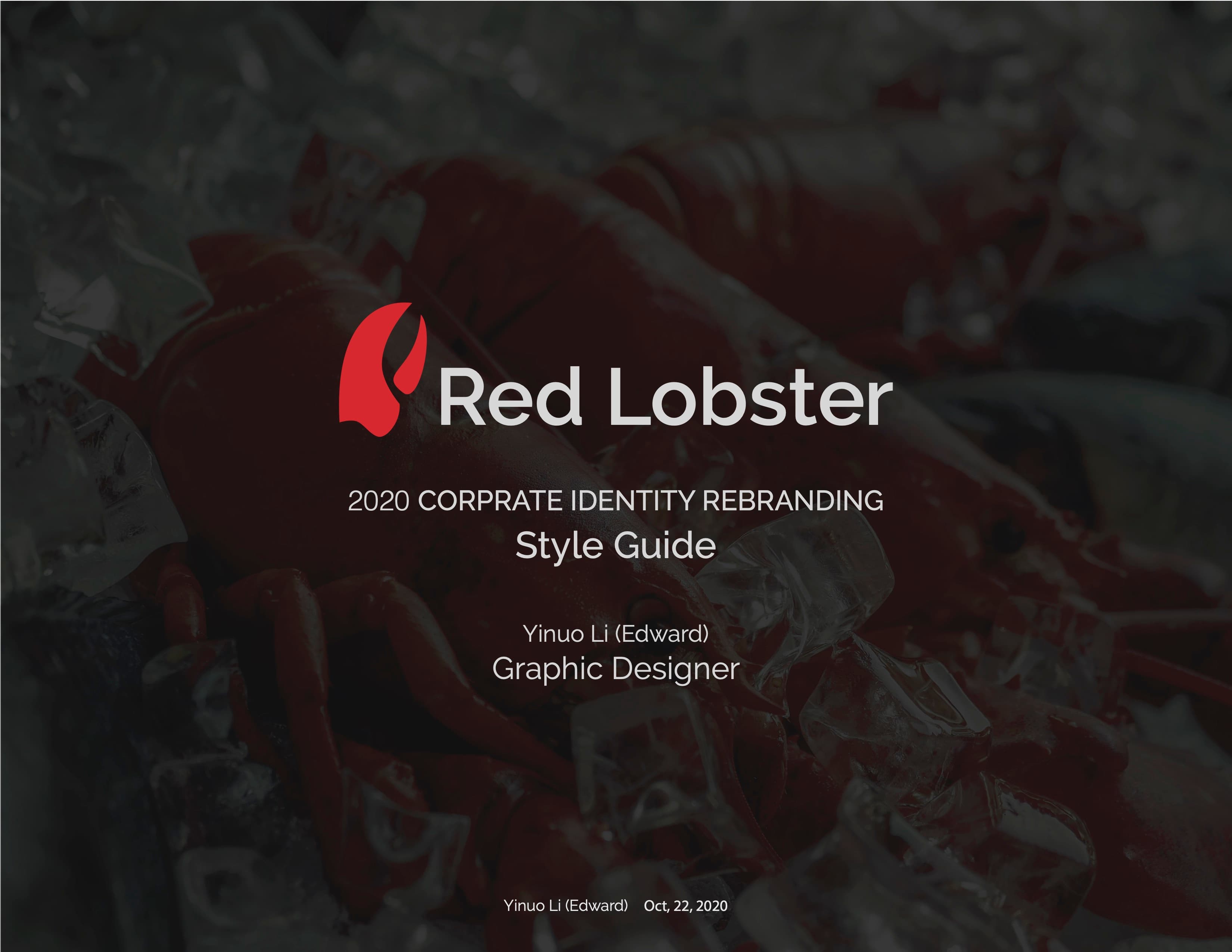
An unsolicited rebrand study for Red Lobster, built around the claw as the one recognizable mark.
An unsolicited student study on the real Red Lobster brand: redesign the logo and build a cleaner, more flexible identity — extending across stationery, signage, staff apparel, a food truck, and a menu board.
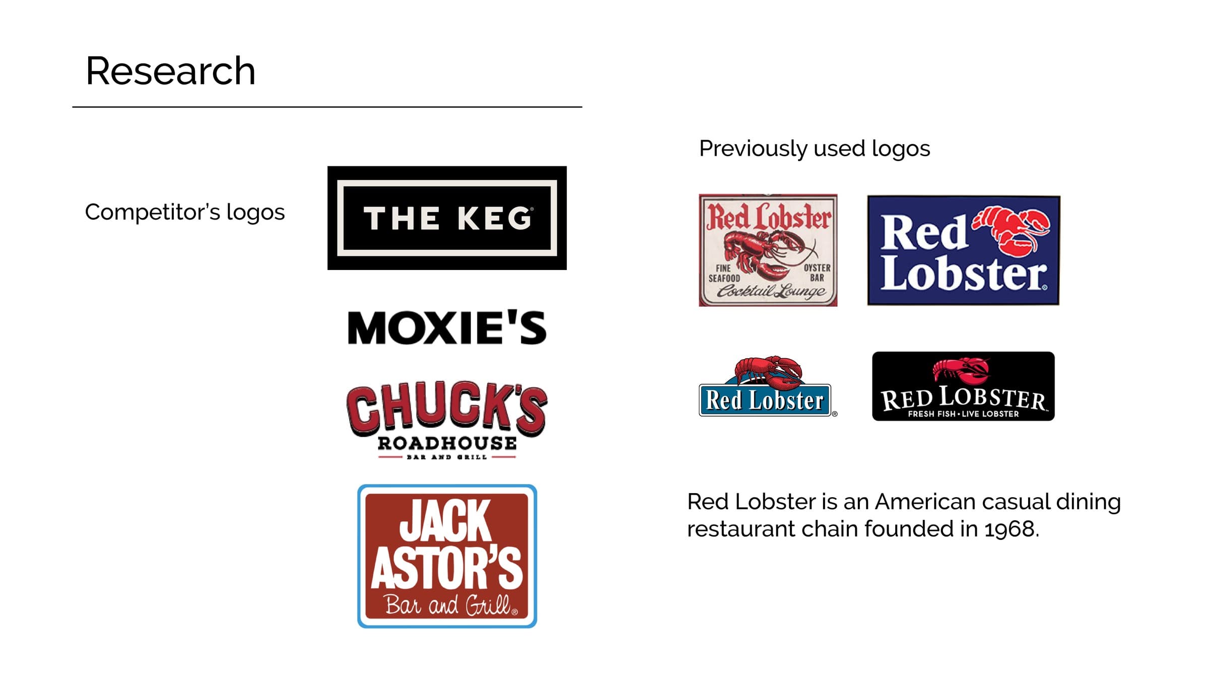
Research every prior Red Lobster mark back to 1969 and its casual-dining competitors, then simplify around one element — the claw — so it reads at a glance and travels cleanly from a business card to a truck panel.
Research first, then the claw
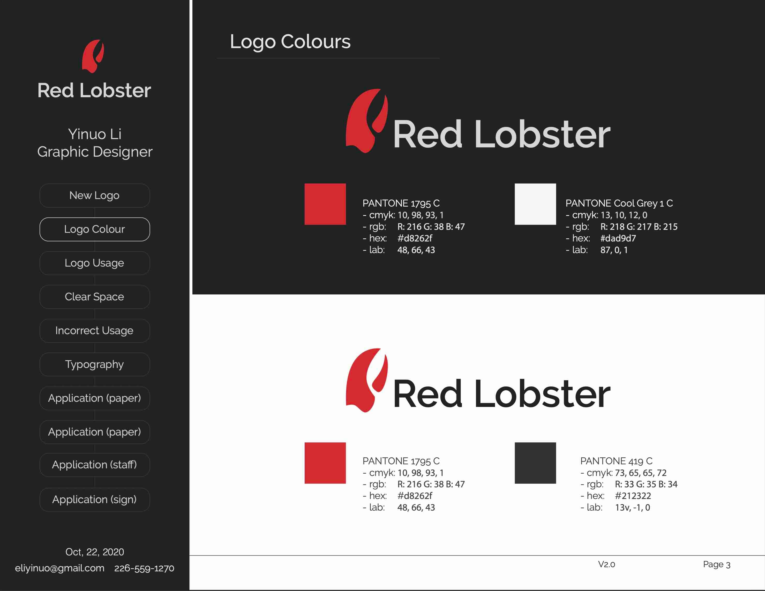
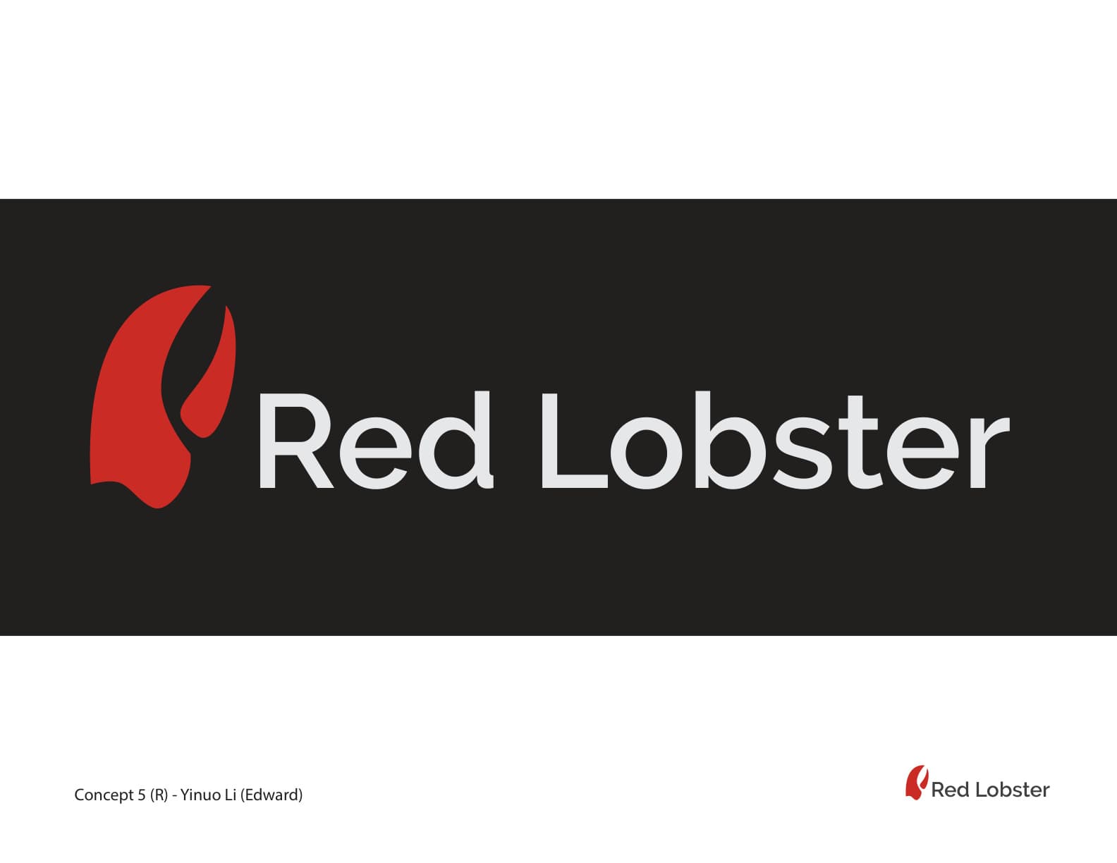
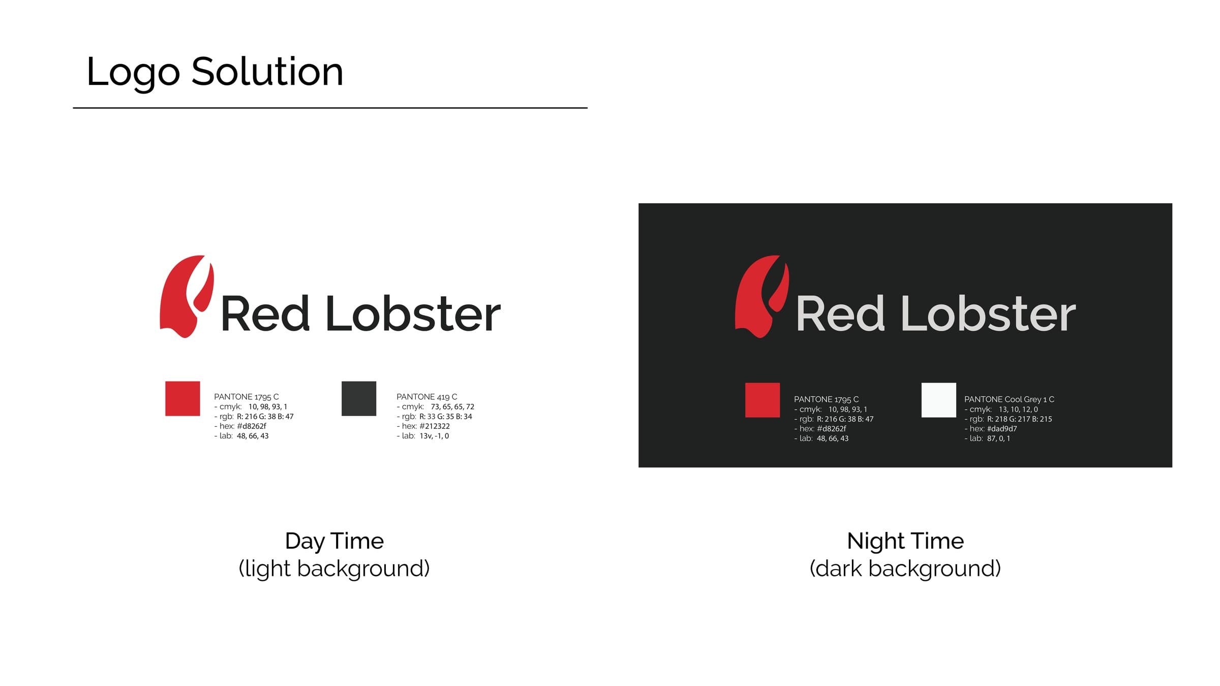
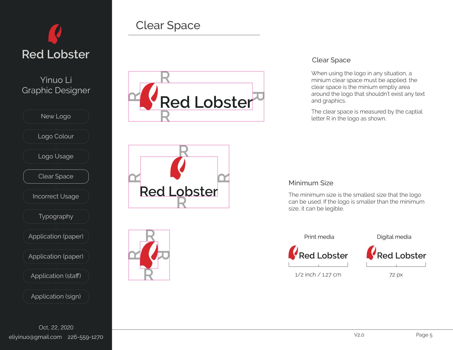
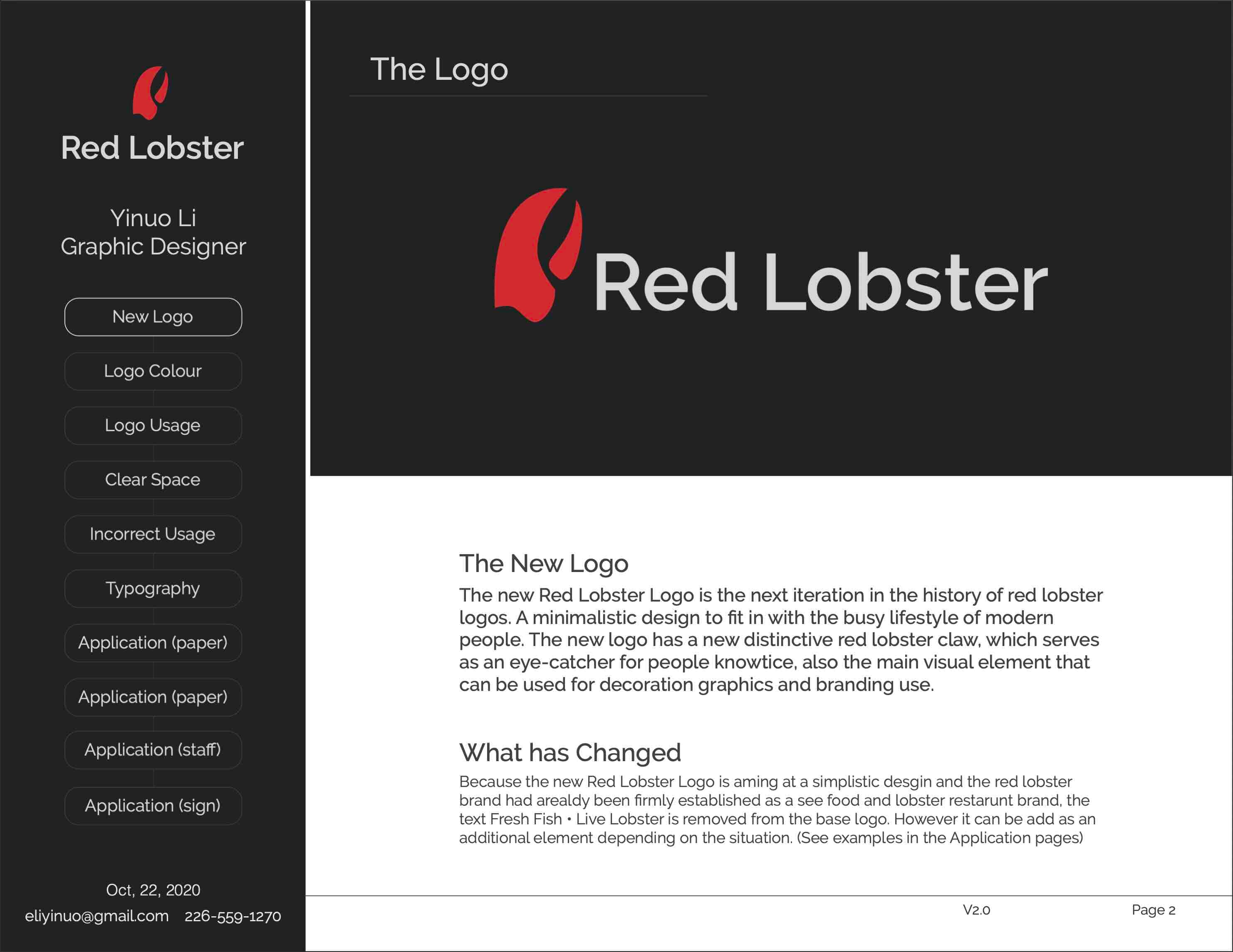
The new logo is the next iteration in the history of Red Lobster logos: a distinctive claw as the sole graphic element, with the restaurant descriptor “Fresh Fish • Live Lobster” dropped from the base mark — since the brand no longer needs it to explain itself — and kept only as an optional line for specific applications.
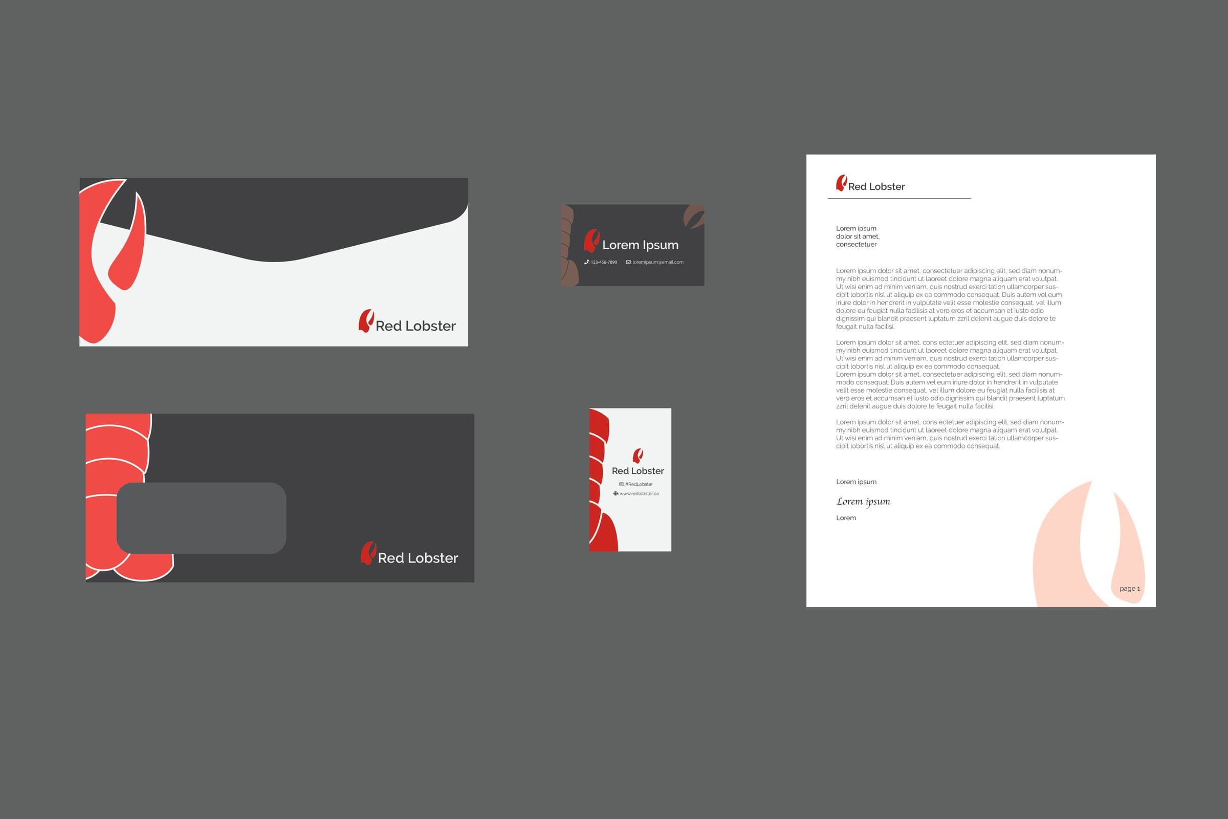
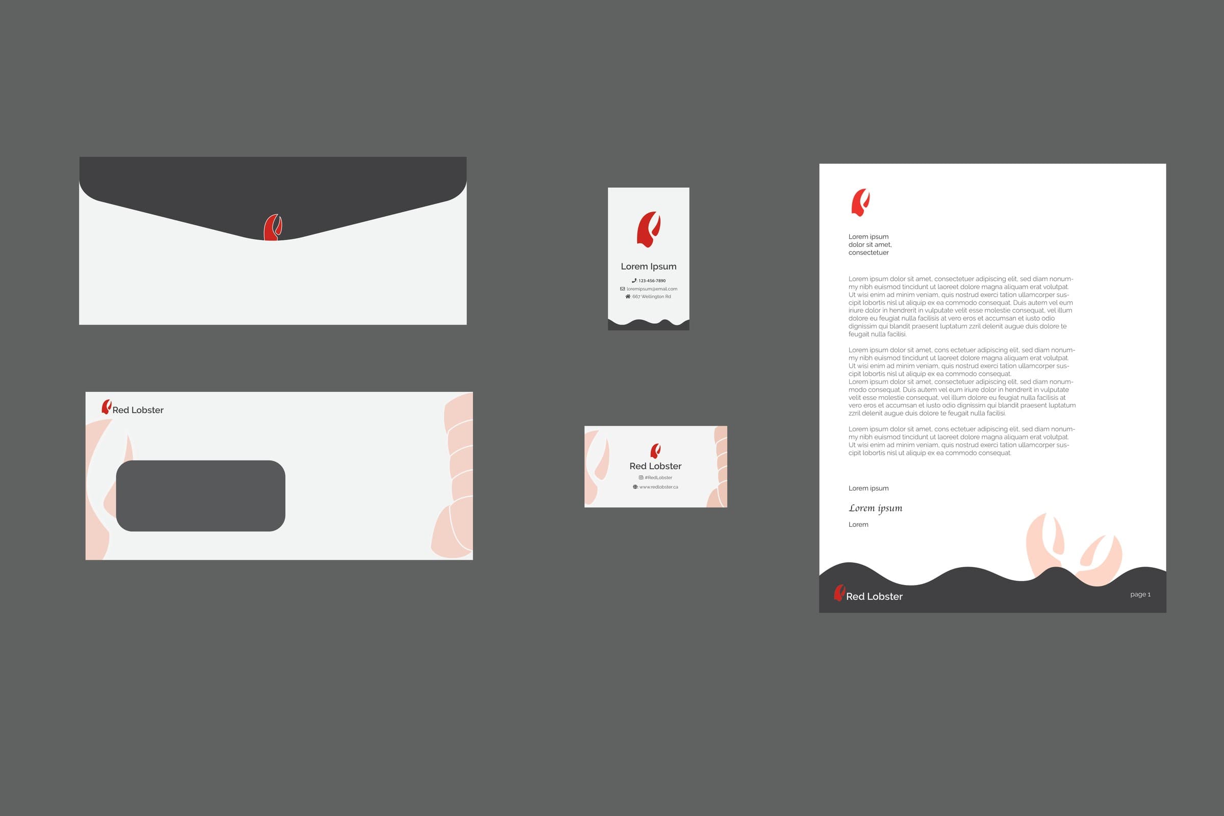
An earlier stationery pass
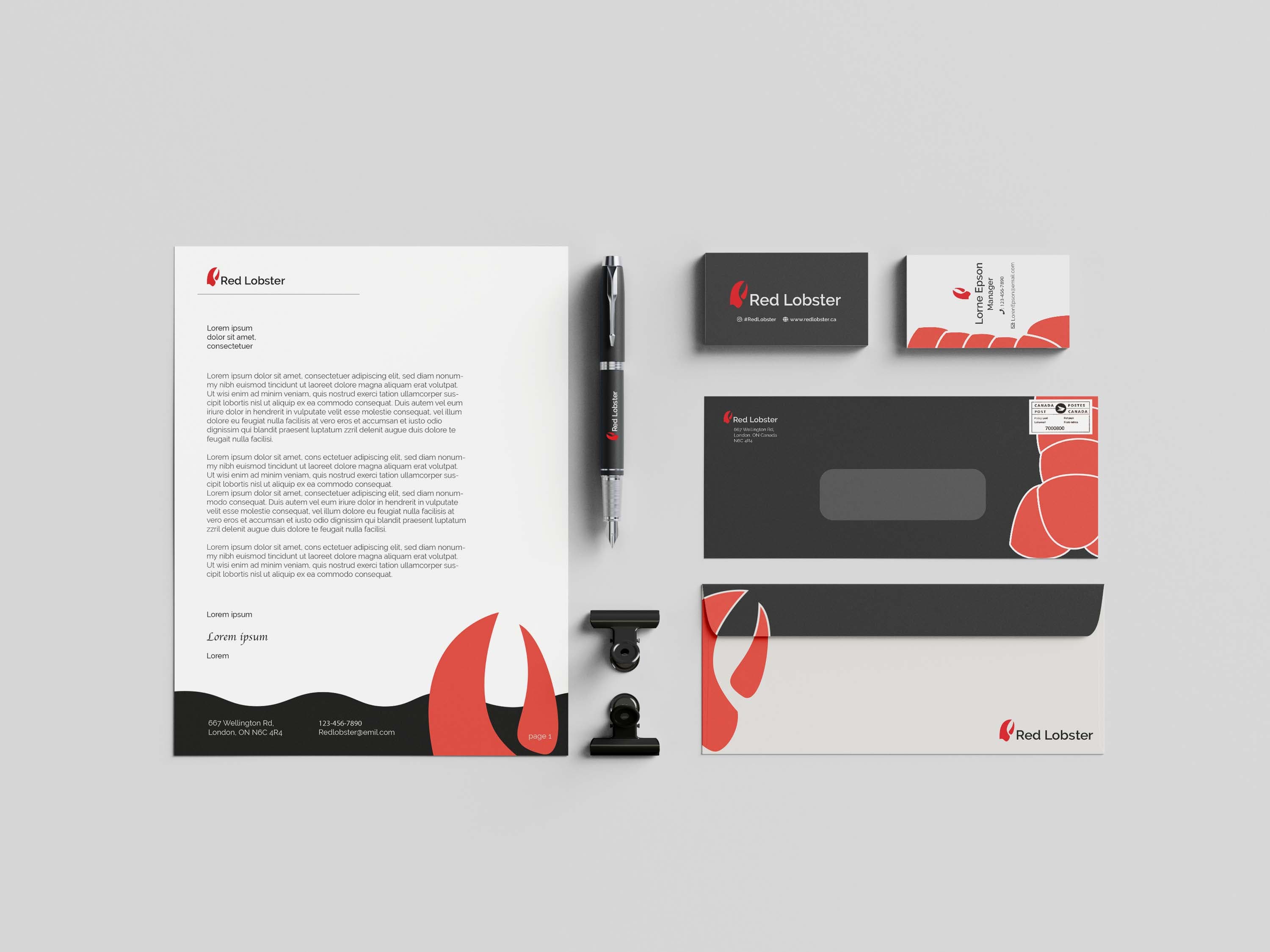
Charcoal and blush, with a wave-cut edge. It felt too soft for a seafood restaurant, so the final system went with one saturated red.
The system in use
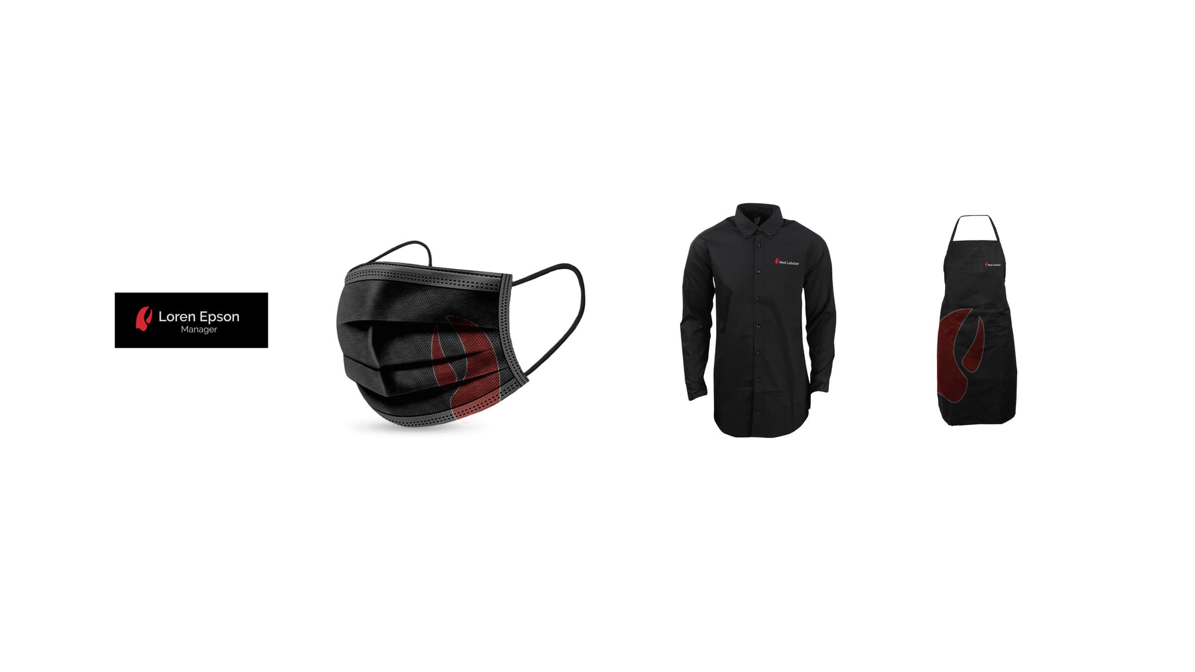
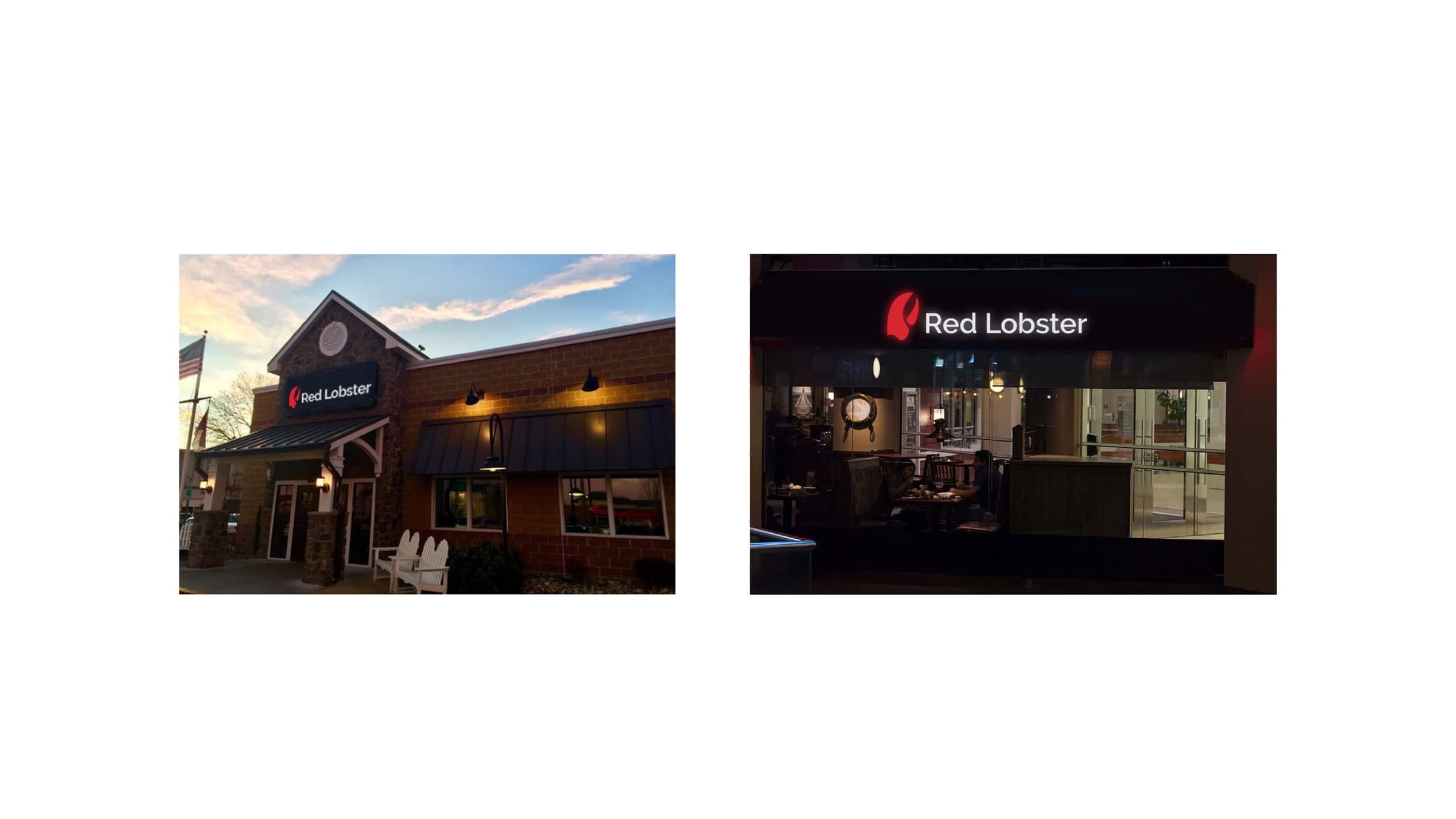
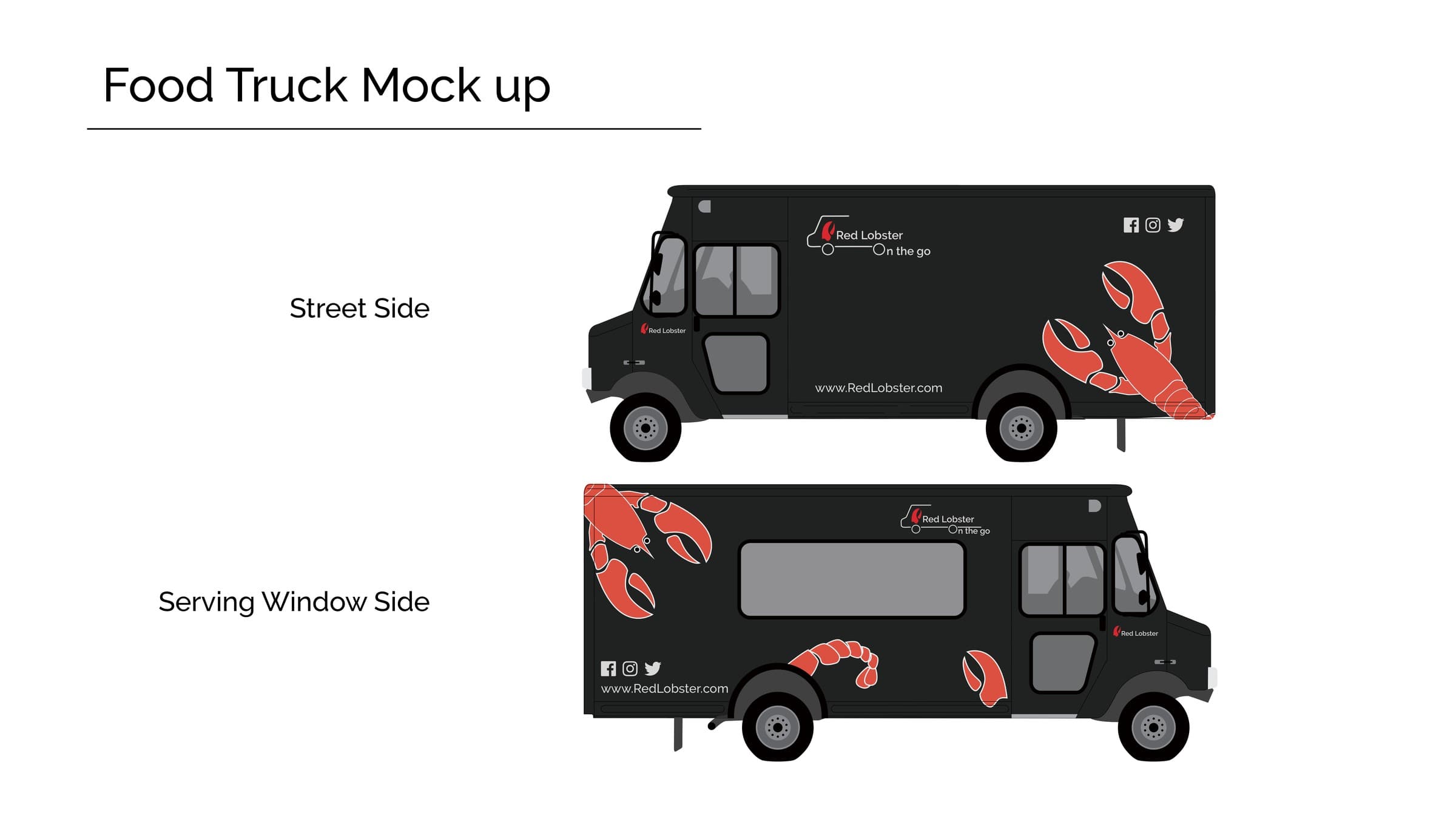
Stationery, staff apparel, storefront signage day and night, and a food-truck wrap — the same claw, the same red, carried at every scale.
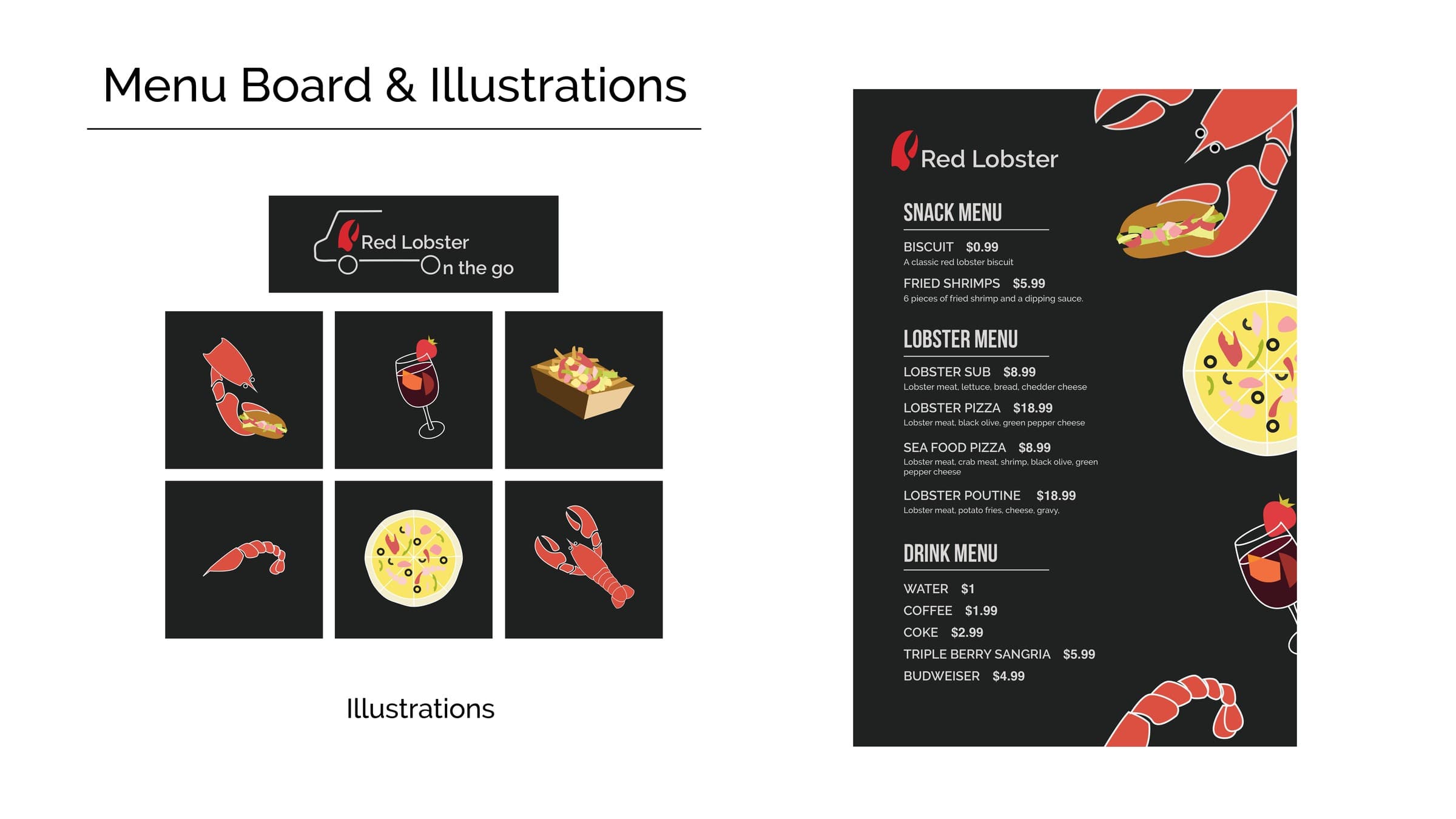
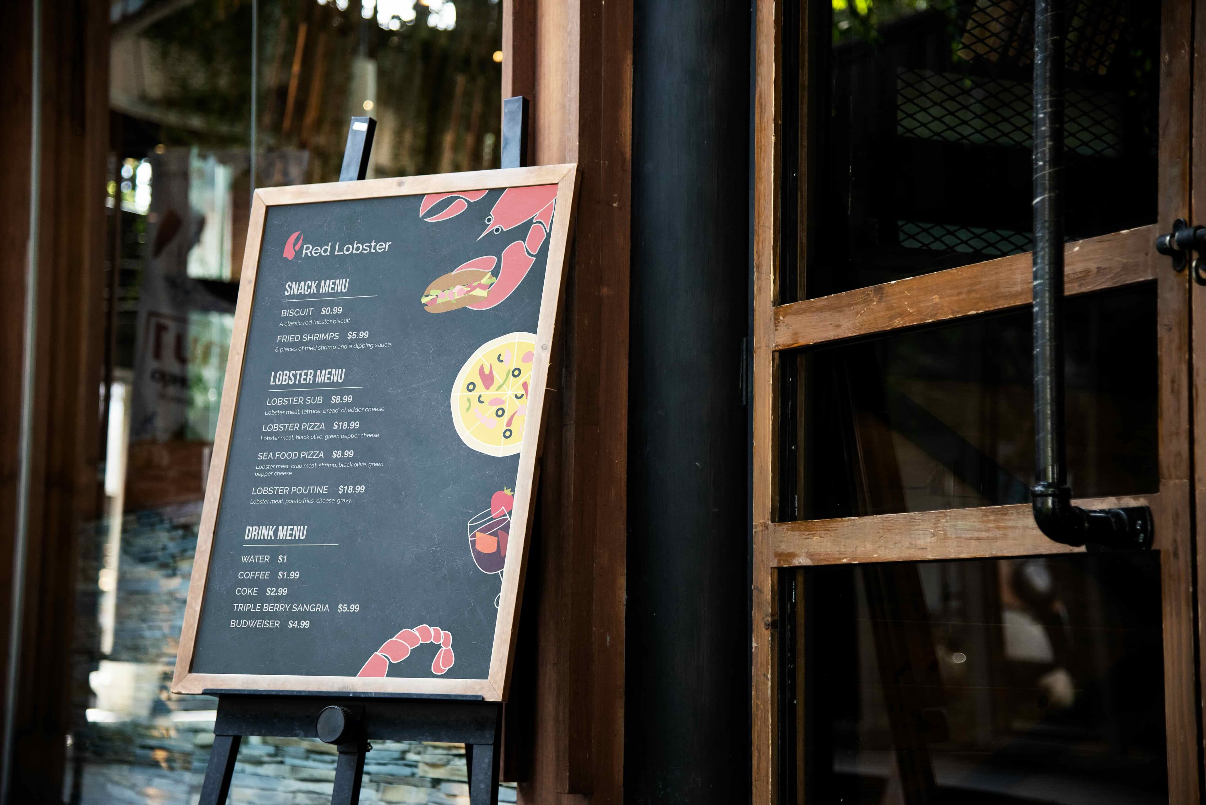
Hand-drawn icons for the menu board
A small set of hand-drawn food icons — shrimp, lobster, pizza, a sandwich — built specifically for the menu board and mocked up on an outdoor A-frame.